Listen to PrestaShop Proper CSS Handling
This blog post is a bit different from our normal blog posts. This is a response to a comment, so the techniques used in the article are not really of any value unless you are developing a custom theme from scratch. The comment was based on my previous article on PrestaShop 1.7, specifically I called the way that the CCC is being handled as lazy. Julien Bourdeau responded with this “”This is considered a lazy way and bad programming practice.”: Again, I would love to read your source and know what you mean by lazy.” This article is going to illustrate a better way to handle CSS / js in PrestaShop and how it should be designed, but is not.
How it currently works
There is no big secret how the CSS/JS in PrestaShop 1.6 and earlier works. What happens is the hooks are loaded and if your module is hooked to one of them it is added to the CCC queue. There are also some page specific files added as well such as the cms.css, the product.css or .js. Basically every page type has its own cache file created for it. In my opinion this is a good way. Not the best way but a good way, an acceptable way, a respectable way.
How it will work in 1.7
In 1.7 the previous way has been thrown out the window. The way that the CCC works in this version is that it compiles everything sitewide into one CSS file and one JS file. So in effect when you are on the home page you are loading the product page CSS as well. This is what I disagree with on a number of levels and called lazy.
Why is it bad?
I am glad you asked. There are a couple of reasons why I consider it bad practice. The first being the code overhead. When you deal with a software package such as PrestaShop that has a lot of modules, a half a dozen different page types, and very specific code for each page; the file sizes grow. Soon you will have a huge CSS file powering a site. Why is this bad? CSS files load from the top down, loading is not really the issue, the issue comes in rendering. Have you ever been on a page with a layout that jumps around until the page is loaded? If so, that is a CSS rendering issue. CSS renders client side, so it directly depends on the client side processor. Which, in Google’s stats, is a mobile phone more than 50% of the time. Mobile phones have less ram and smaller processors than their desktop counterparts. They are more susceptible to code overhead issues.
Who else thinks this is bad?
Google thinks it is bad. Which search engine do you want to think you are doing everything right? Google, they have the biggest market share. From what I understand, and I could be wrong on this point; the starter theme is a stripped down theme made to develop off of. Let me explain why Google thinks this approach is bad, and how bad it is. Google has started using their Page Speed metric as a ranking factor. It is not one of the higher signals, but this could change at any time.
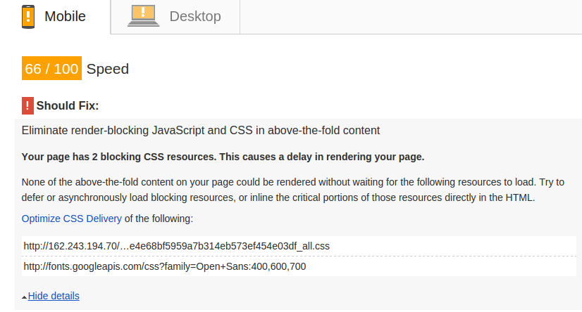
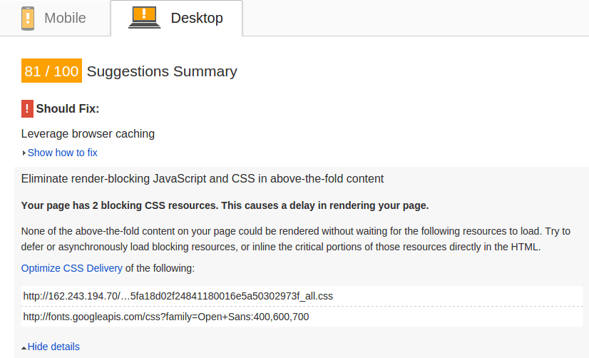
With CSS in Google’s page speed tool there are 3 levels of grading. The first is passed, which means you did everything right. The second is “Consider Fixing” which basically means there is room for improvement. The third is “Should Fix” which of course means you should fix this. Below is the results of running the new PrestaShop starter theme through the Page Speed tool.


What this means is not only I, but Google as well thinks this is a problem. So obliviously there is a problem with this new method. I realize what PrestaShop was trying to do with this method, they wanted to rely on cache files to increase the loading speed, but this method is not the best approach for a system like this.
I have a better solution
The solution would change how hooking is handled for modules, but should be a relatively easy change for module developers, and it even would have 100% backwards compatibility so module developers could choose not to use it. Theme developers could also opt to either use this change or not use it as well.
What I would propose is add new hooks to PrestaShop specifically for CSS and JS. Add a new hook for every page type and two positions for every hook. Some like below.
displayProductCSSMain
displayProductCSSSecondary
displayCMSCSSMain
displayCMSCSsSecondary
ect
Also there would be new general hooks added as well. Something like this should work displayCSSMain and displayCSSSecondary. Those can handle the site wide CSS files. Of course this solution does not need to be just used with CSS, the JS needs the exact same system as well.
I am sure you noticed there are main and secondary hooks for every CSS hook that was added. But what are they for? Speed, specifically for rendering speed.
Take a look at this screenshot below of the PrestaShop starter theme.

In this view there are only about 6 modules showing, the language block, the block cart, the currency block, the home slider, the top menu, and the home featured. These modules should hook to the displayCSSMain. Other modules that are on the footer of the site and lower than the fold should hook to the displayCSSSecondary. The reason being is you can deliver a more compact faster rendering CSS file if you do this. Google grades you on rendering.
At the same time the global.css needs to be broken up into two files as well. One needs to handle the above the fold styling, so it is called in the displayCSSMain, while the other needs to handle the below the fold styling and it will be called in the secondary hook.
Sure this approach will take more work and will be a little bit harder. But it will also help site owners in the long run and PrestaShop will be delivering a better product as well.
Wait, multiple requests are bad though
They are not the best thing in the world, true. But when playing by someone else’s rules, I am talking about Google, you have to use their techniques. The multiple resource issue quickly becomes a non issue because of two factors. First is what Google suggests doing with multiple resources, you can read about it here. Their idea is pretty simple. It is to load the page, then after the page loads and renders, make a call for the other resource file. Lazy loading, this has been around a while and can be incorporated into the system very easily for both the CSS and JS files. This actually makes the impact of the site smaller and faster loading and quicker rendering as well. The second factor that comes into play is HTTP/2, it is the newest version of the HTTP protocol. It drastically improves the loading time of multiple resources and combines the request. This is a technology that is supported by every major browser already. So all you have to do to benefit from the technology is to upgrade your server or switch to a host that supports it. To see how much quicker it is, check out this demo from Akamai.
About the lazy comment
Specially to address the comment I made in my last post calling the current method lazy. What I meant is the method used is literally the easiest way to create cache files for a programmer. It takes the least amount of work to do it this way. The previous method was more amount of work. What I feel like is the case is that PrestaShop 1.7 is being rushed out of the door. In the rewrite of this area someone made a decision to just rewrite it the easiest way possible and not the best way. I think if one piece of the software is being written this way, multiple ones are going to be written this way too.
About the Author: Lesley Paone
Lesley has worked in e-commerce for over a decade, and is the founder of dh42. Starting out with PrestaShop and brancing out into other platforms like Shopify. He loves all things e-commerce and loves a challenge, in his spare time he helps moderate several forums on SEO, e-commerce, as well as the PrestaShop forum. If you have any questions for him about any of his articles just use our contact form to contact him.
